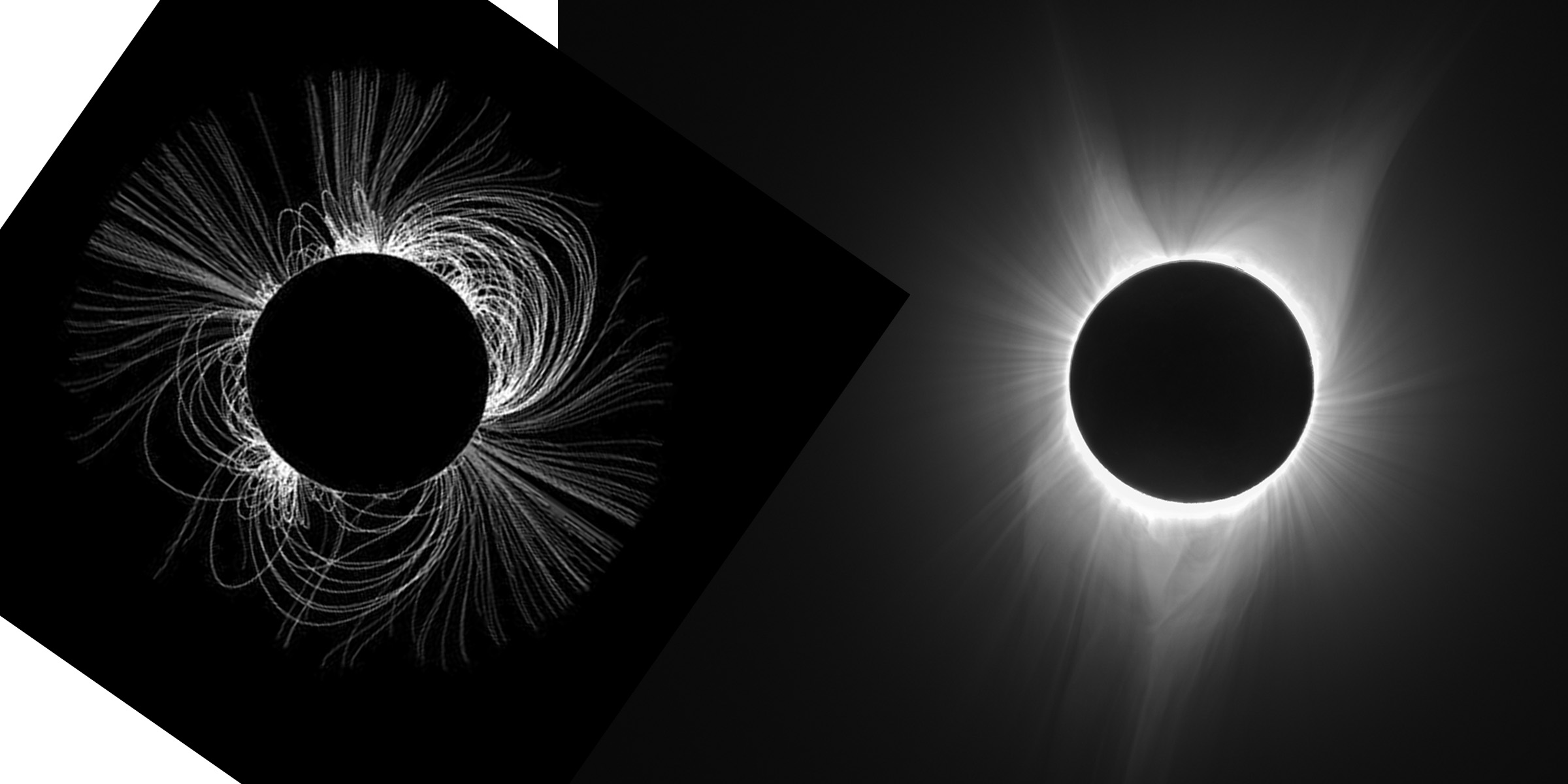
I encountered a report about the predicted corona and wondered how it would compare to what we actually saw. I do not know the orientation of either the simulation or of my image (where is the solar north pole?). Are these similar?
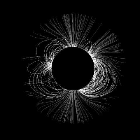

Update 20170906: I still don’t know the absolute orientations of either image, but found that there was a correlation of the field lines that seem to stream directly out from the Sun. See if this is a visual match: